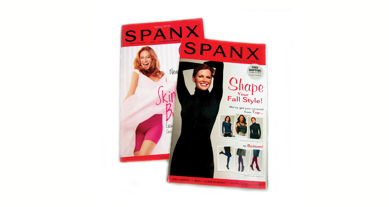
SPANX
As Creative Director, my role was both managerial and hands-on design and art direction. My main focus was upgrading the sophistication of the photography and launching new products within the Spanx and Assets by Spanx brands. Keeping the brand marketing sophisticated to match their high price points, yet approachable, was part of the every day creative challenge, along with ensuring that copy is always encouraging, playful, and exciting.
SPANX Swim Collection
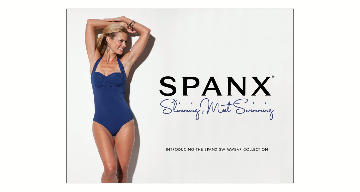
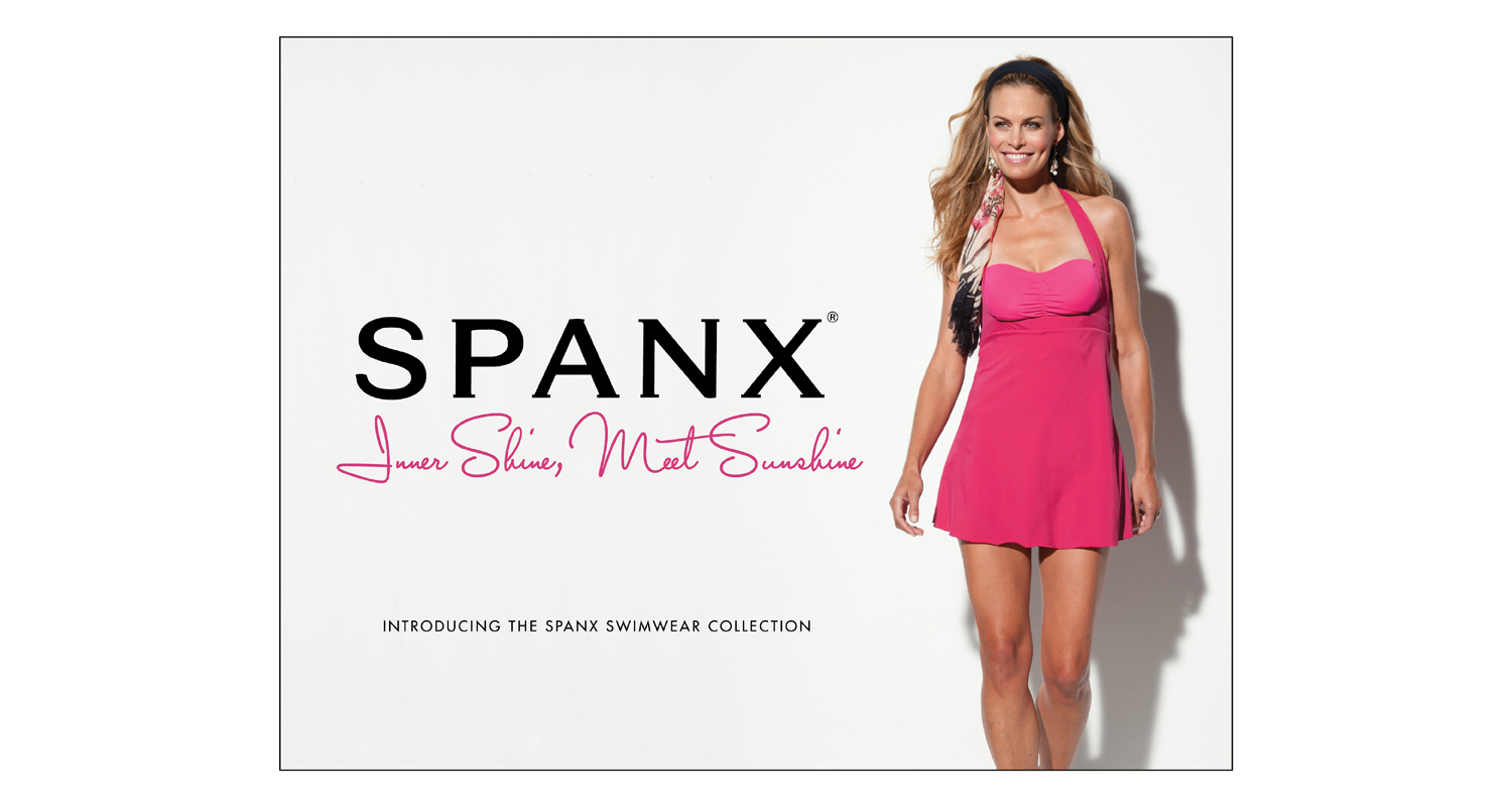
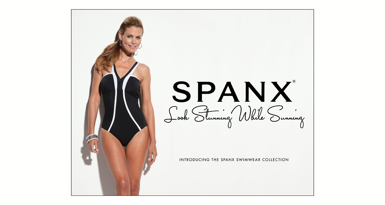
Photography Upgrade. Samples of photography for the Spanx Swimwear Collection. The line had a soft launch prior to my arrival, but the models casted were too young for the brand and product. These graphics also incorporate copy that feels playful, but describes the functionality of the product and how the consumer will feel when wearing it.
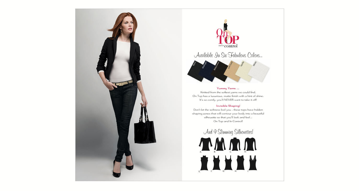
On Top and In Control
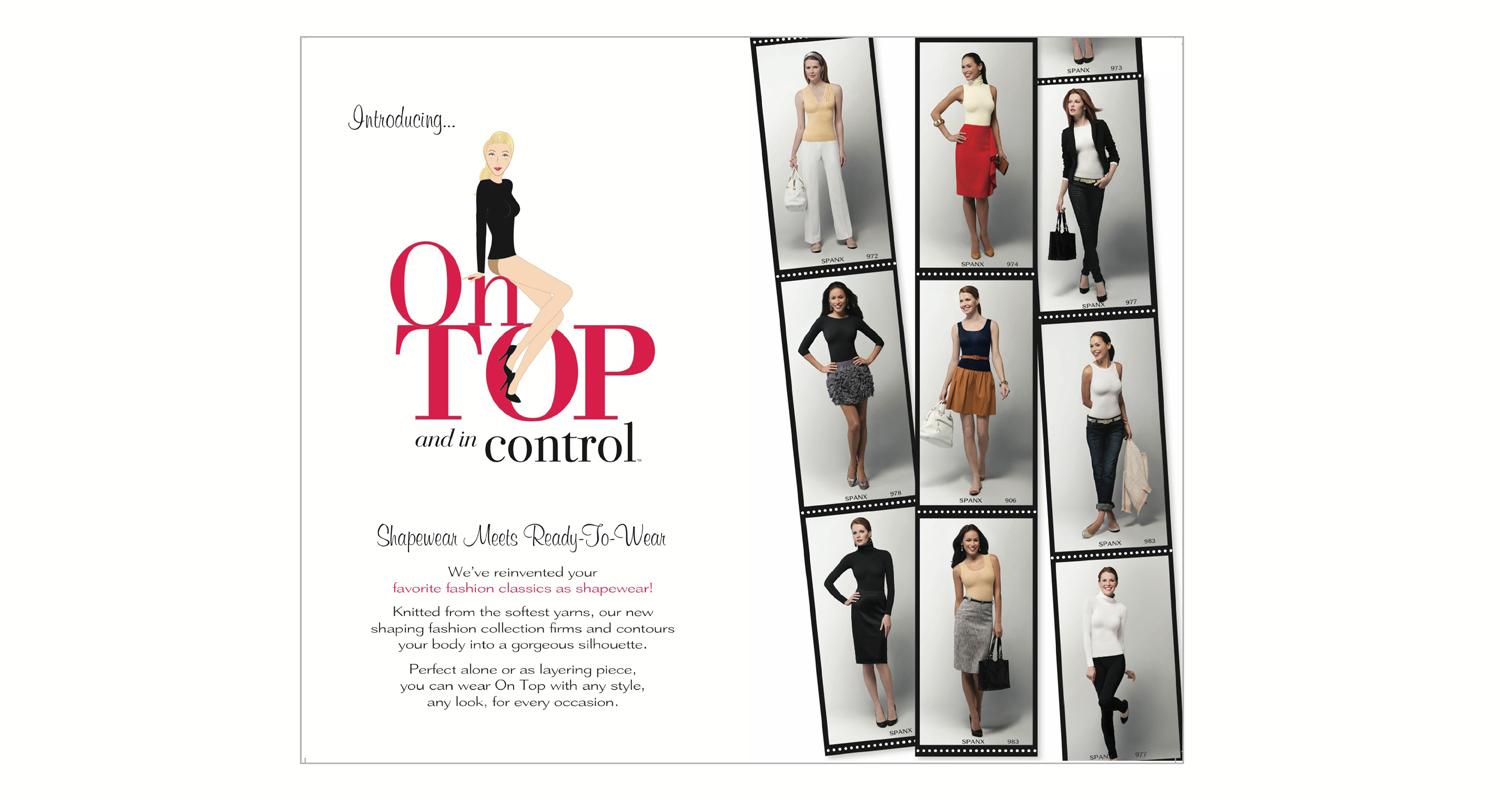
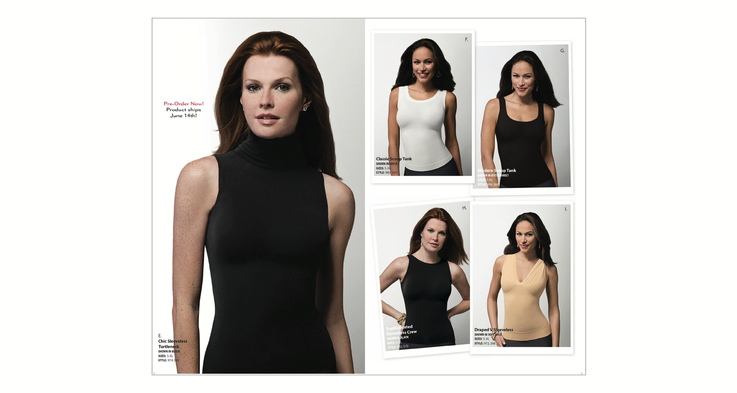
Shapewear Meets Ready-To-Wear. We launched this product line as a new category of shapewear: shapewear pieces meant to be seen. Below are examples of the product's name, logo, brand product photography, catalog spreads, online photography and copywriting.
More Product Launches
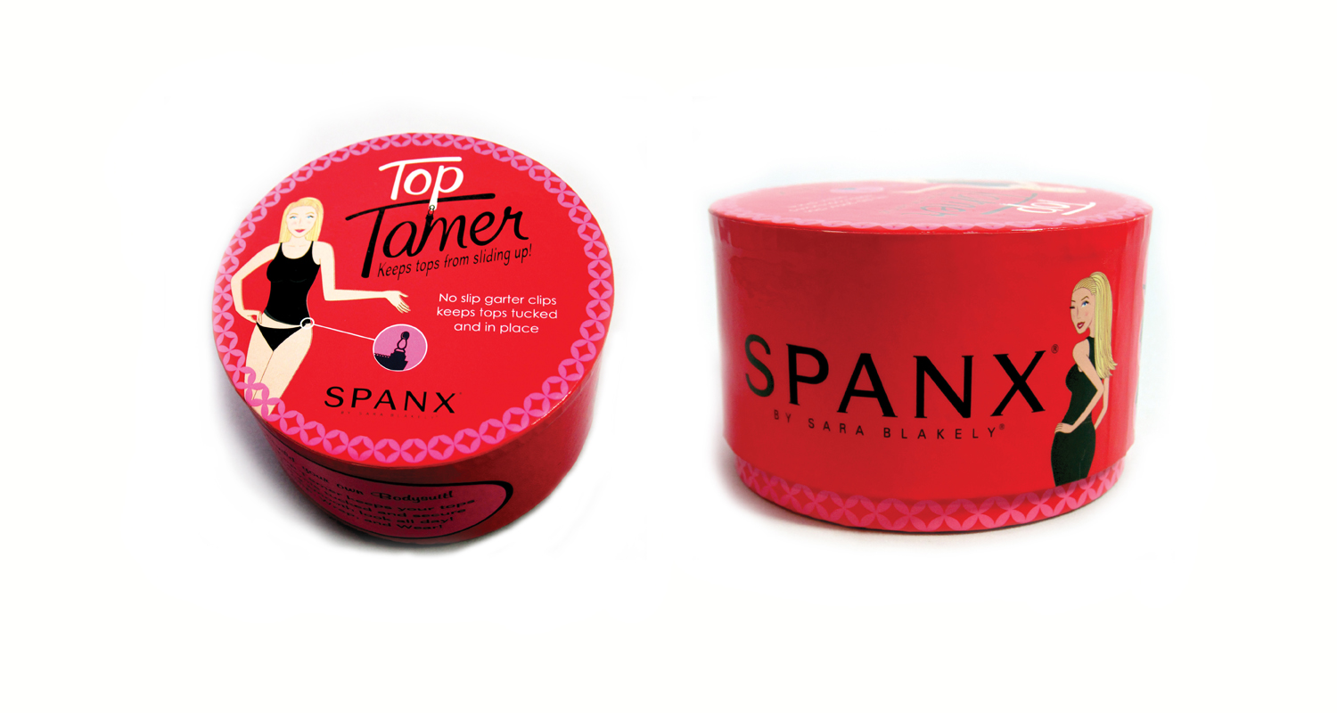
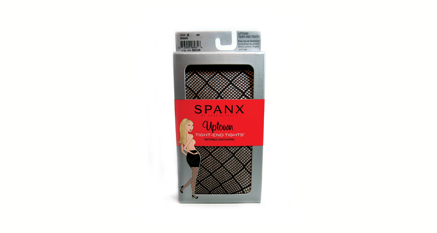
Packaging Designs & Product Naming. We launched an average of 8-10 new products every season. Our team named the products, designed their logos and packaging, and completed all other collateral requests needed to market the new products, such as signage and mailers. Below are examples. "Top Tamer" packaging was inspired by vintage face powder boxes. "Uptown Tights" got its name from its fancy patterns and high price point.
SPANX Catalogs
We produced about 10 catalogs per year. With each production, I worked with the team to improve the overall layout design, copy headlines, and product photography, which created a more cohesive, clean book that still maintained a high product density.
Creative Team:
Creative Director: J. Padgett

