KCNY BRAND LOGO UPDATE
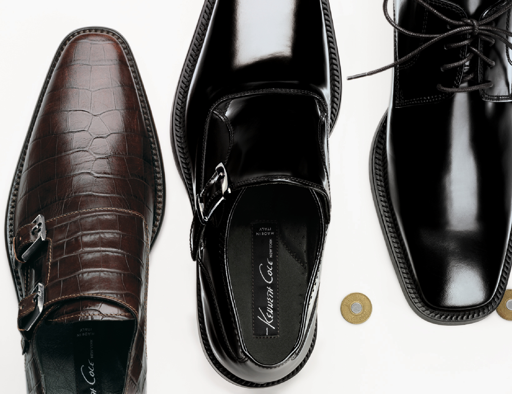
In a company-wide movement to reposition the brand for a more upscale feel, I pitched and won the opportunity to create the new brand identity and logo. Part of Kenneth's brand was his unique voice, and it seemed appropriate to use his actual signature as the logo for his namesake brand. It lends a personal feeling and also felt like his renown brand quotes. In a time before everyone was using handwriting in their marketing, this solution gave his brand a personal touch. This project was less about the cool nature of the logo itself, but the experience of being able to influence this brand’s repositioning from top to bottom. Here are some of my favorite pieces.
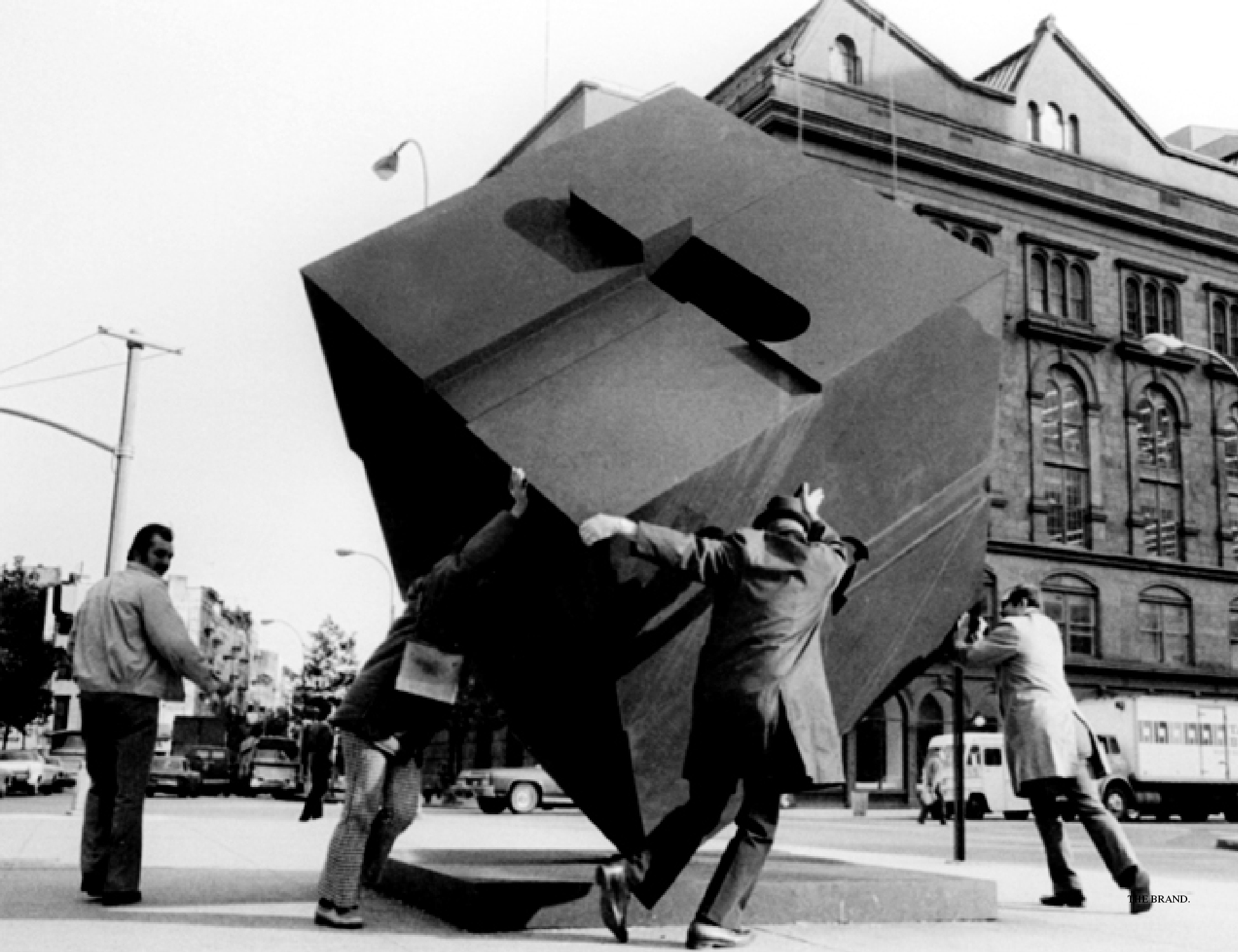
THE THINKING BEHIND THE WORK: THE BRAND BOOK












Packaging & Collateral
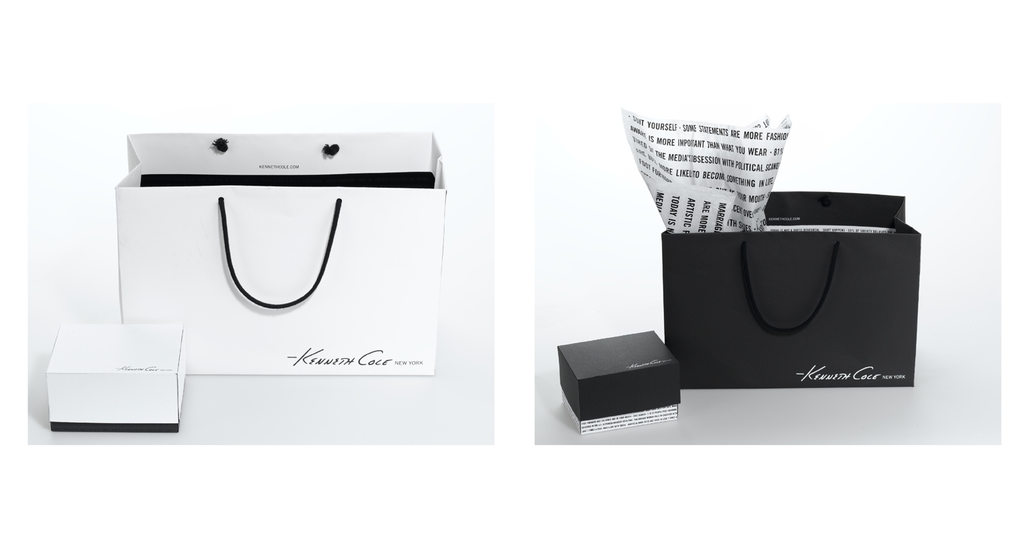
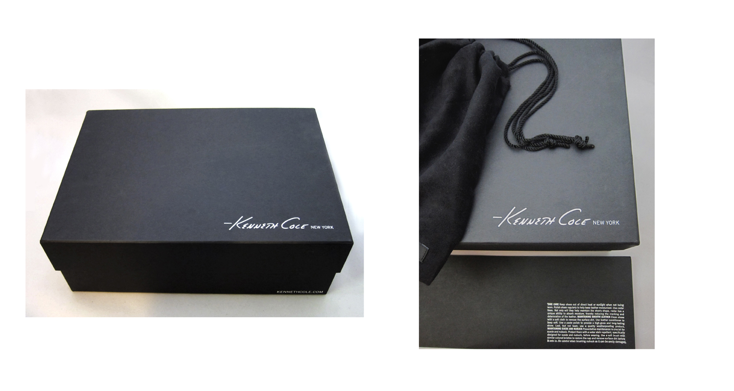
Time to redesign...everything. All corporate and retail materials changed their design to feature the new logo and design direction. All new brand collateral was produced with uncoated and recycled materials to emphasize the brand's values on recycling and waste. Colors and papers were to match my formulated off-white and off-black. The shoe box is a non-collapsable box wrapped with spec black uncoated paper, logo and url are white hot-stamped. Talker is black uncoated with all type white hot-stamped.
FUN GRAPHIC DESIGN: BRAND MAILER
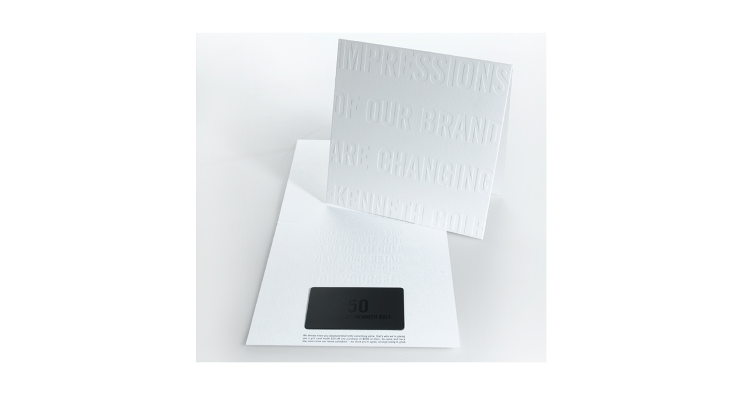
The essential brand pun here incorporates both design and copy: "Impressions Of Our Brand..." infers not just to the brand's renovations, but also to the fact that this piece is almost entirely letterpressed (a printing technique of impressions made into paper on a letter press).
Art Direction and Design: J. Padgett, L. Nguyen
